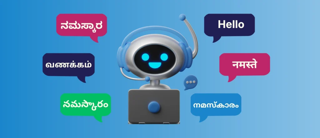
In today’s global marketplace, a brochure is often the first impression your brand makes. When that brochure needs to speak more than one language, the challenge multiplies. Multilingual brochure design isn’t just about translation—it’s about clarity, culture, layout, and user experience. Done right, it builds trust. Done wrong, it can confuse or even offend your audience.
Let’s explore the most common pitfalls in multilingual brochure design—and the pro tips that help you avoid them.
Common Pitfalls in Multilingual Brochure Design
1. Treating Translation as a Simple Word Swap
One of the biggest mistakes companies make is assuming translation is purely literal. Languages differ in structure, tone, and length. A direct translation may be grammatically correct but culturally awkward or misleading.
2. Ignoring Text Expansion and Contraction
Some languages take up significantly more space than English (like German or French), while others take less. Poor planning leads to cramped text, broken layouts, or unreadable fonts.
3. Overlooking Cultural Sensitivity
Colors, images, symbols, and even gestures carry different meanings across cultures. A visual that works perfectly in one region may feel inappropriate or confusing in another.
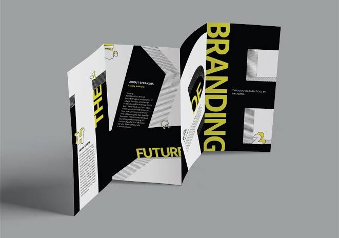
4. Using Non-Professional Fonts
Not all fonts support all scripts. Using the wrong font can result in missing characters, broken text, or poor readability—especially for languages like Arabic, Hindi, Chinese, or Thai.
5. Skipping Linguistic and DTP QA
Many multilingual brochures go live without proper proofreading or desktop publishing (DTP) quality checks, leading to alignment issues, mistranslations, or formatting errors.
Pro Tips for High-Impact Multilingual Brochures
1. Involve Language Experts Early
Work with professional translation and localization services from the planning stage. Native linguists understand both language and cultural nuance, ensuring your message feels natural.
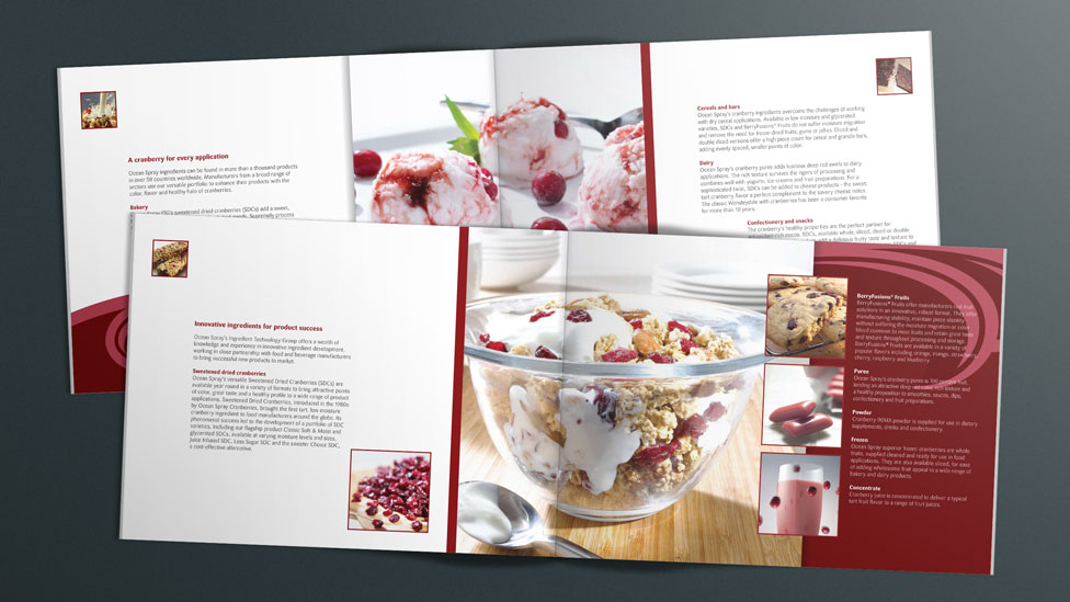
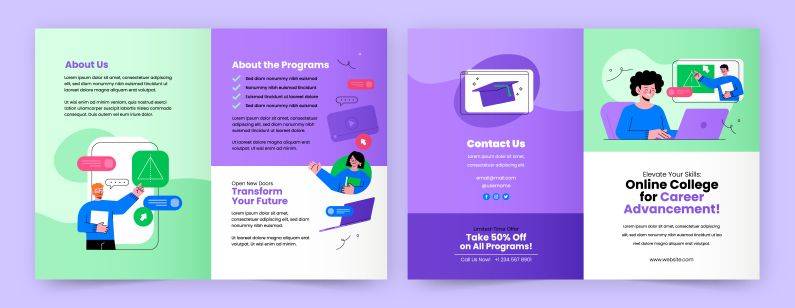
2. Design with Localization in Mind
Create flexible layouts that can accommodate text expansion. Avoid embedding text into images unless necessary, and always keep editable source files.
3. Localize, Don’t Just Translate
Adapt headlines, calls to action, measurements, currencies, and examples for each target market. This is where true localization adds value.
4. Choose Unicode-Compatible Fonts
Ensure your fonts fully support all required languages and scripts. This guarantees consistency across print and digital formats.
5. Perform End-to-End QA
Always run linguistic review and DTP checks before final delivery. A polished brochure reflects professionalism and builds credibility.
Final Thoughts
A well-designed multilingual brochure bridges language gaps and connects your brand with global audiences. By avoiding common mistakes and following proven localization best practices, you can create brochures that are not only visually appealing but also culturally accurate and conversion-ready.
When language, design, and strategy work together, your brochure doesn’t just speak—it resonates.
 Gaming Computer
1 × $940.00
Gaming Computer
1 × $940.00
 Smartphone Vivo
V9 1 × $899.00
Smartphone Vivo
V9 1 × $899.00 SanDisk Flash
Drive 1 × $756.00
SanDisk Flash
Drive 1 × $756.00 Smart Power Bank
1 × $723.00
Smart Power Bank
1 × $723.00
 Apple Smartwatch
1 × $1080.00
Apple Smartwatch
1 × $1080.00


.jpeg)